

Overview
Studio is the creative heart of Dimension — describe what you want, and the AI Composer writes the React/TypeScript code. The live preview updates in place. When you’re happy, Publish.Natural Language
Describe what you want in plain English — AI writes the code
Real-Time Preview
See changes instantly with your actual data as you build
Full Ownership
All code is yours — download, modify, run anywhere
Privacy by Design: by default the AI sees your data schema (field names like
deviceName, osVersion) but never your actual data values. Tenant admins can opt in to AI data access under Settings → AI. See Security & Privacy.Builder Mode
Dimension has two modes: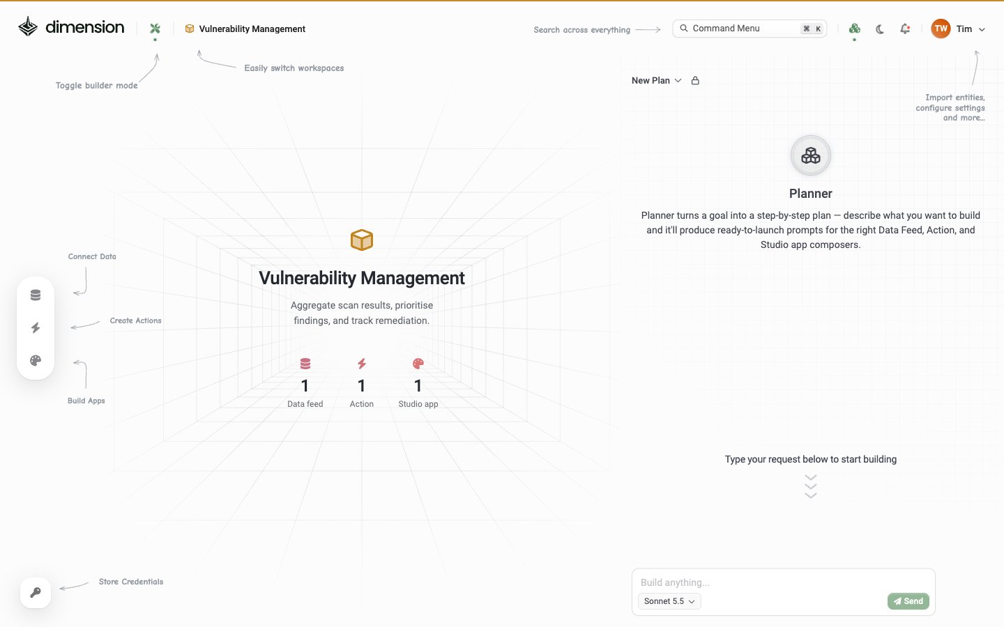
Editor anatomy
When you Edit an app, the Studio editor opens. Here’s every region: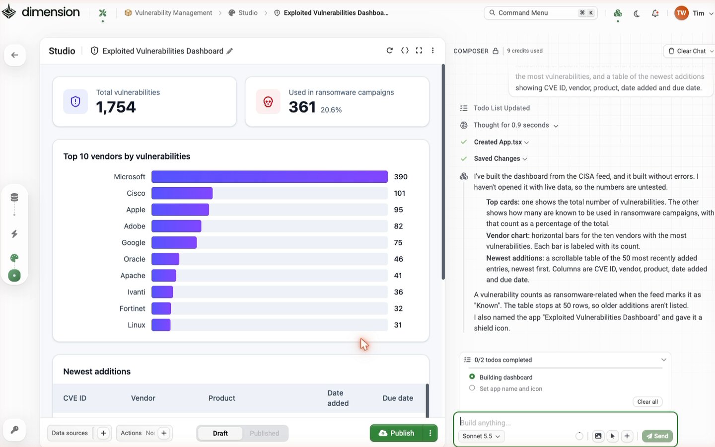
Top toolbar (left side)
Top toolbar (right side)
Live preview (centre)
The middle column renders the app live with whatever data sources you’ve wired. Changes from Composer prompts appear here within seconds.Bottom toolbar
Composer panel (right side)
The AI Composer lives here. Header shows the conversation’s credit usage and a Clear Chat button. The conversation thread shows your prompts plus Composer’s step-by-step trace (Thought for X seconds, Created App.tsx, Saved Changes, summary bullets). The input footer has Add image, Inspect component, Add component template (+), and Send.
The textbox placeholder changes contextually:
Build anything…— on a fresh app, before any promptsEnhance or amend…— once the app has been generated, signalling iterative edits
The Studio editor ⋯ menu
Click ⋯ in the top-right of the editor: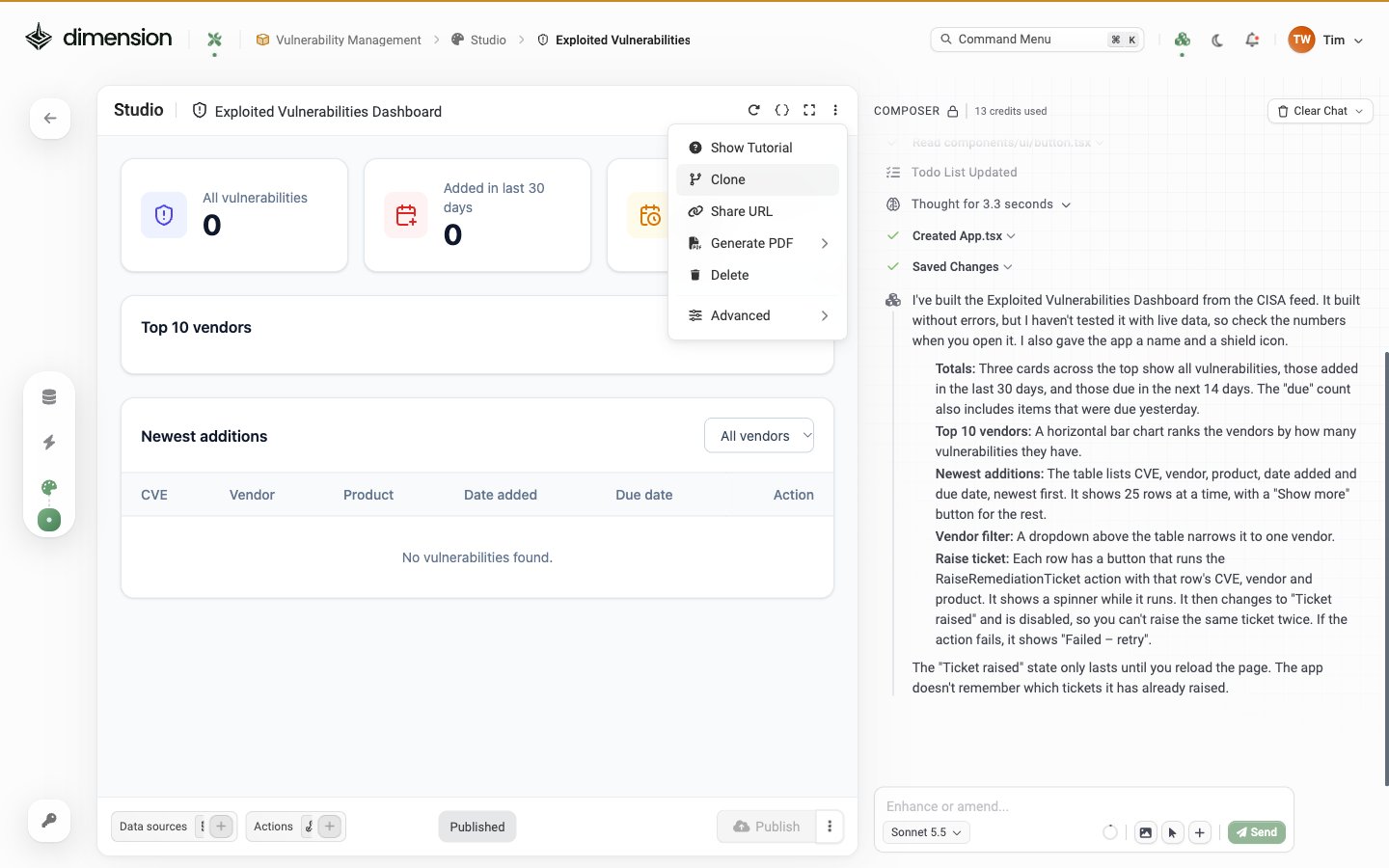
Advanced submenu
Draft and Published
Every app has two states:
The toggle and Publish button live at the bottom-centre. Unpublish is in the 3-dot menu next to Publish.
Publishing makes the app visible to everyone with access to the workspace and exposes the launch surfaces (Gallery, Command Menu, Share URL).
X-Ray — source code viewer
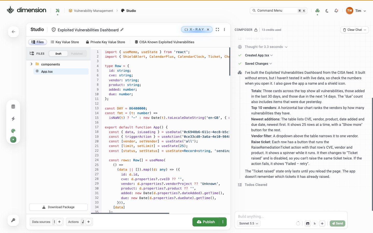
Click< > in the editor header to open X-Ray:
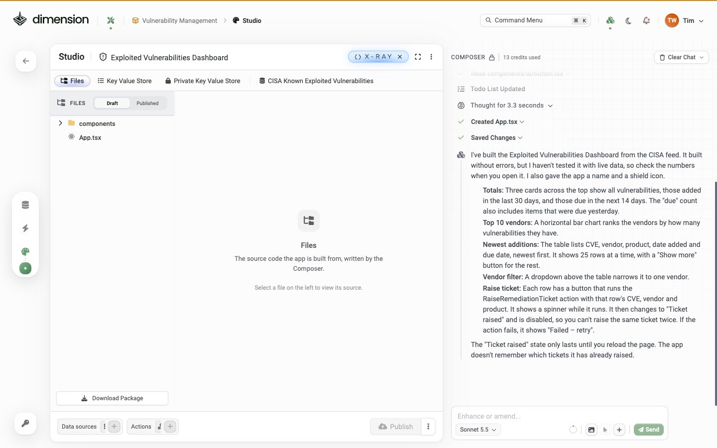
Files tab
A file-tree explorer of the React/TypeScript source the AI generated. Click any file to view its source on the right. Top of the panel has a Draft / Published toggle for diffing. Bottom of the panel has a Download Package button (same artefact as ⋯ → Advanced → Export). A freshly-built app with only a header and button shows a singleApp.tsx at the root and a components/ folder (visible in the X-Ray screenshot). Larger apps generate additional files as components are added.
Key Value Store tab
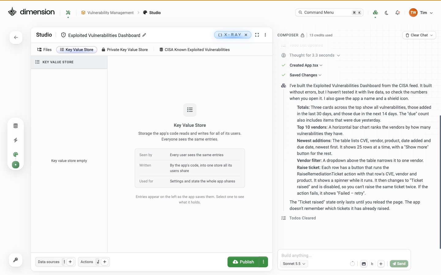
- User preferences — “Save the user’s selected department filter to the KV store under
pref:dept” - Workflow state — partial form data between page navigations
- App-level config — values an end user can edit from the in-app Settings page
- Counters and cursors — sync watermarks, page-position memory
Studio Apps tab
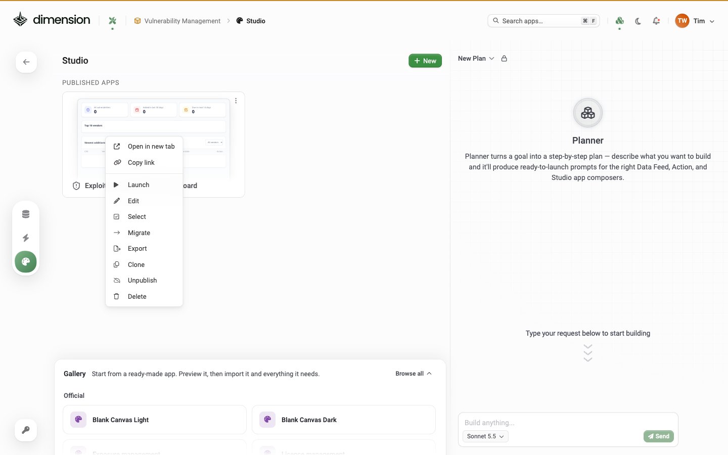
The Studio Apps list shows every app in the workspace, grouped into Published Apps and Unpublished Apps, with a + New button and the Gallery of templates below: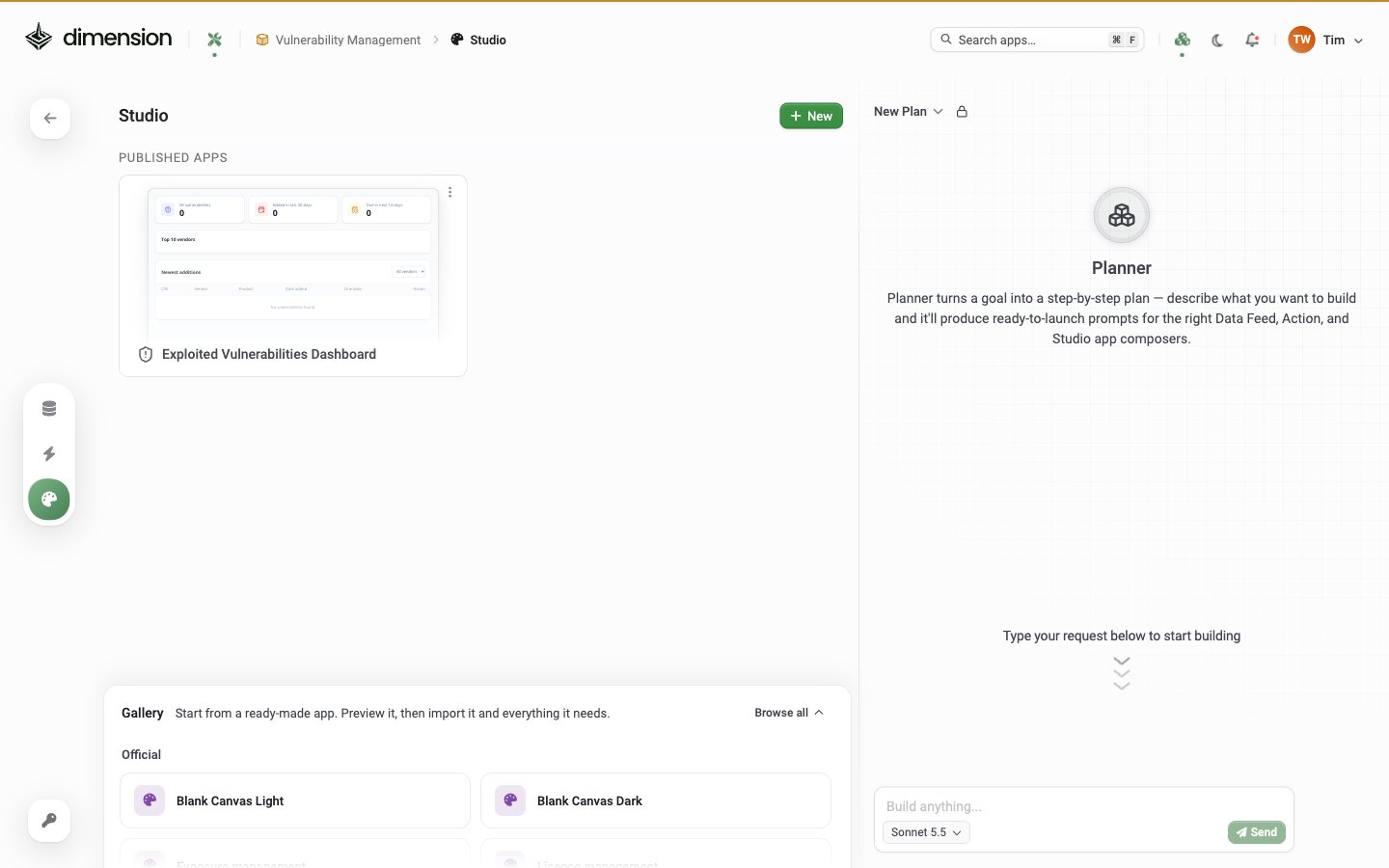
Templates available right now
The expanded Gallery section at the bottom of the Studio apps list: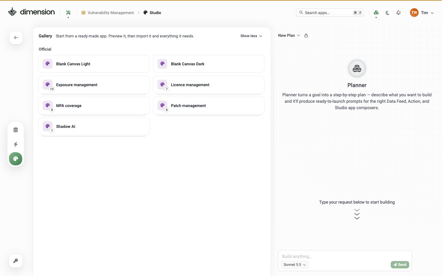
- Blank Canvas Light (Official) — light-mode starting point
- Blank Canvas Dark (Official) — dark-mode starting point (ideal for SOC wall displays)
Command Menu (⌘K)
Press ⌘K (or Ctrl+K) anywhere in Dimension to open the palette: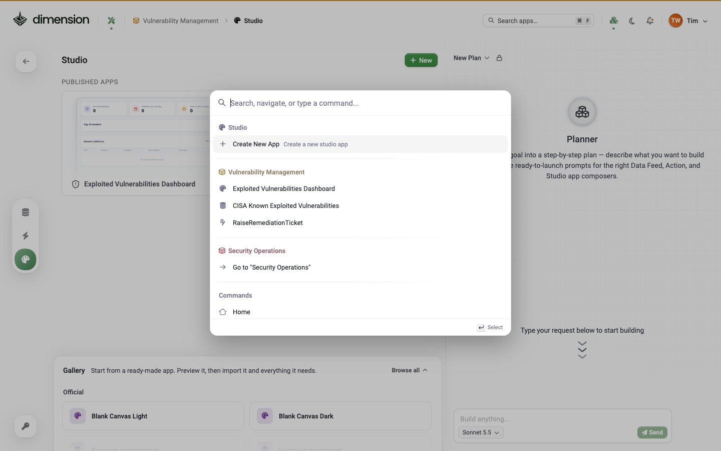
The header search field is dual-mode:
⌘F— search within the current view (e.g. filter the visible app tiles)⌘K— open this Command Menu
Getting started
1
Enter Builder Mode
Click the wrench icon next to the Dimension logo. The workspace overview opens with the left rail and the Planner.
2
Create or open an app
- New — open Build Apps in the left rail and click New, or pick Blank Canvas Light or Dark from the Gallery
- Existing — right-click a tile and choose Edit, or hover and click the Edit action button
- Pre-built — import an app from the Gallery. See Pre-built Apps
3
Connect Data (if needed)
Apps that need external data reference a Data Feed. Build the Feed first via its Composer, then click + next to Data sources at the bottom of the Studio editor.
4
Build with conversation
Type prompts in the AI Composer on the right. The live preview updates per prompt.
5
Publish
Click the Published chip at the bottom-centre. The app becomes visible to everyone with access to the workspace; a Shortcut is auto-created.
Application types
Dashboards
Real-time views of your security posture.Reports
Detailed analysis exportable as PDF.Tools
Interactive applications with user input.Trackers
Monitor specific initiatives or projects.Explore further
AI Composer
Composer footer, prompts, Inspect Component, component templates, Restore checkpoint
Components
The component library — General, Form, Popups, Navigation, Layout, Charts, Tables
Themes
Brand colours, dark mode, per-app overrides
Exporting, Sharing & Cloning
PDF, Clone, Share URL, Export, Migrate, X-Ray code download