

- Tenant-wide dark/light mode — global toggle in the platform header
- Per-app theme override — independent dark/light setting inside any launched app
- Per-app branding — colours, fonts, logos applied through Composer prompts
Global dark / light mode
Every Dimension screen has a theme toggle in the platform header (the moon icon next to your avatar). It applies tenant-wide and persists across sessions and devices.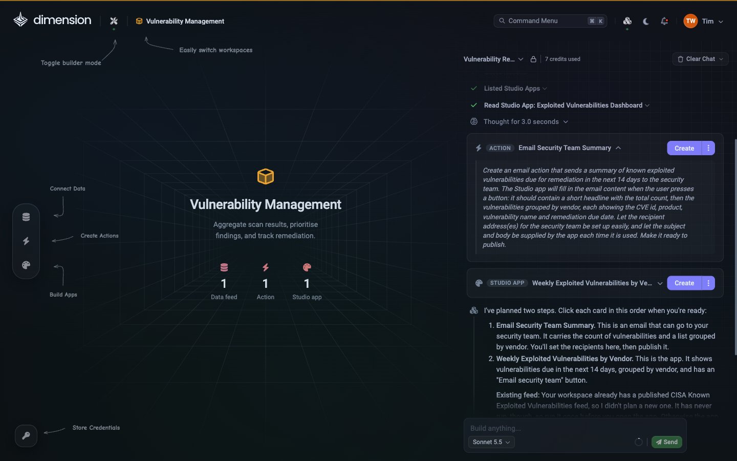
Per-app theme override
Every launched app has its own theme toggle in its header — independent of the global setting. This is useful when:- An app should be dark by default (NOC wall displays)
- An app should be light by default (printable reports, executive PDFs)
- The user wants to override the global choice just for this app
Brand colours through Composer
Apply your brand palette by asking:Typography
Logos and header branding
Card styling
Chart theming
Chart components respect a shared palette. Override per-chart or globally:Wall-display optimisation
For NOC / SOC wall displays:Per-app Settings page
An app can have its own Settings page in its sidebar, with preferences such as theme, thresholds and configuration values. This is part of the app you build, not the platform, so it looks however you ask Composer to make it. It’s separate from the platform’s Settings area. To add a Settings page to a custom app:Branded PDF exports
PDF exports inherit the app’s current theme. For board-pack-ready output:Reusable theme tokens (roadmap)
Today, theme settings are applied via Composer prompts and stored in the app’s generated code. A shared theme tokens system — where multiple apps reference the sametheme.tokens.json file — is on the roadmap.
In the meantime, paste the same brand prompts into every app you build for consistency. Or clone a well-themed app and edit from there.
See also
Components
Every component you can theme
Prompt Engineering
Including the reusable Branding snippet
Recipes
Wall-display, brand-it, semantic-colour recipes
Exporting & PDF
PDF formats and the Schedule roadmap